
March is historically a strong month for the stock market. However, this year, it wasn’t until around the middle of the month that we saw most markets start to make gains. While those gains were focused on the Technology and NASDAQ space, the S&P 500 also showed some signs of (good but not great) improvement.
What I’m finding intriguing is that the market has been changing direction, or at very least its tone, around the 15th of the month. It has done that several times over the past year. I’m not sure if it is something significant or just something to be aware of. It is certainly an interesting data point to note.
The NASDAQ / S&P500 ratio has continued, quite strongly, to favor NASDAQ. This allocation has helped us deal with volatility while keeping some money invested in that positive area of the market. When the market is uncertain, we’ve been using that time to position to a “Market Neutral” allocation (owning the strong sector and shorting the weak one).
Seasonally and historically, April tends to be good for most parts of the market. The Stock Trader’s Almanac shows quite a few high-probability days where the market is positive. More than many other months in the year. Again, just an interesting note to consider.
This is the part where I would normally talk about the recent bank failures. I sent out an in-depth commentary email on March 20th. If you didn’t get it, let me know and I will send it to you. No need to re-hash it here. And Will does a great job this month adding insight to the situation, so check out his article here.
What fascinates me most right now is that it seems very obvious that the “R” word (Recession) is most certainly in our future. But the fear of it seems minimal. Maybe that is because we’ve been expecting it for so long now that we’ve gotten used to the idea. But in any case, the Yield Curve (2-year and 10-year treasury yields) are inverted, which historically projects a recession about a year in the future. Maybe we have time to fit in a few strong months before we start to feel it?
The Federal Reserve did again raise interest rates 0.25% this month, as was largely expected. There are many who think they should have stopped before this increase, but it doesn’t really matter what others think they should do. Other countries, like Canada, have stopped their rate increases. Time will tell who made the better choice.
Our Shadowridge Long-Term Trend indicator has gone back to being negative, even with the positive shift in price action we’ve seen since mid-month. We had previously hoped it would stay positive while the shorter-term indicators turned from Red to Green (Negative to Positive), but it didn’t play out that way.
Our Mid-Term Cycle signal went back to Positive on March 28th and we used that slightly down day to remove any short market positions. That has paid off so far. Now the question is, will that strength continue for a month or only last for a few days? Seasonality would suggest a continuation, but I’m very much aware that the market will do what it wants, regardless of the season.
As of Wednesday night (March 29th, 2023), our Shadowridge Dashboard showed Positive to Negative sectors as 4 to 7, which is the same as it was this time last month. Technology and Communications are again on the positive side, along with Consumer Discretionary and Consumer Staples. The RRG (Relative Rotation Graph) charts are also suggesting that there is underlying strength across most sectors of the S&P500. If that can continue, it would also favor a strong April. You can see those graphs posted weekly on my Twitter feed.
For this month’s chart, let’s look at the RRG chart I keep mentioning. This shows the relative movement (rotation) of each S&P 500 sector vs T-Bills (BIL). The chart also shows where each sector has been and where it appears to be heading. We interpret it as a positive sign when most (or all) sectors are moving out of the Red (Lagging) box and into the Blue (Improving) box. And it’s even better when they head to the Green (Leading) box. This should theoretically be good for the entire S&P 500 index until these sectors start moving into the Yellow (Weakening) box. That is when a run would be expected to slow down.
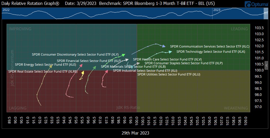
Five-day Relative Rotation Graph (RRG) of the eleven S&P 500 sectors vs T-Bills (BIL) (Source: Optuma)

1 The Standard and Poor’s 500 is an unmanaged, capitalization-weighted benchmark that tracks broad-based changes in the U.S. stock market. This index of 500 common stocks is comprised of 400 industrial, 20 transportation, 40 utility, and 40 financial companies representing major U.S. industry sectors. The index is calculated on a total return basis with dividends reinvested and is not available for direct investment.
2 Charts are for informational purposes only and are not intended to be a projection or prediction of current or future performance of any specific product. All financial products have an element of risk and may experience loss. Past performance is not indicative of future results.