
I’m sure you’ve noticed how different the countryside looks when flying over it in an airplane, so we are going to take a look at the financial markets from a similar perspective to see what we can glean.
This first chart shows the S&P 500 Index over past 30 years, and you can see there are long cycles where the market trended either up or down. But notice the peaks in 1999 and 2007. They top out at about the same levels. This is called a “double top” to us market-watchers.
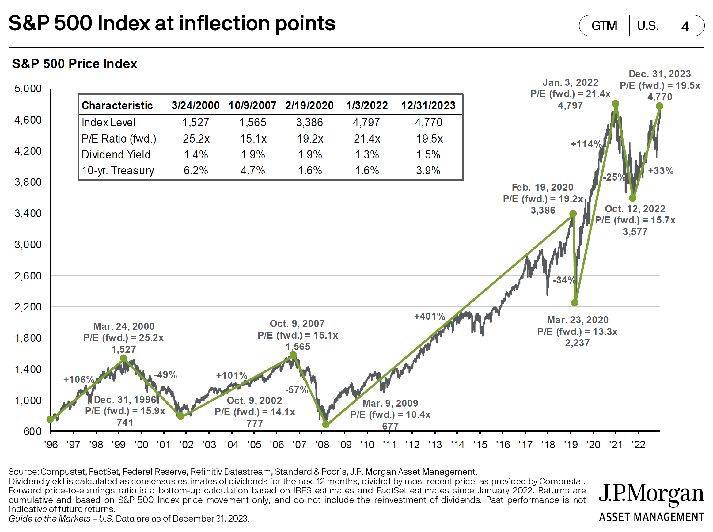
When a market falters at the same price point as it did earlier, this is called “resistance.” It is called this because, for some reason, buyers begin resisting the urge to buy at these prices. It is the point at which sellers outnumbering buyers becomes obvious.
No one knows exactly why this happens, but holders of stock, especially those who bought just before the previous peak begin to think “I’ve got my money back” or “I’ve made a nice little profit” and “I’m nervous about current events and I think I want to just watch for a while” – and they begin to sell.
The reason this chart is significant is that we have another potential double top in place right now. This condition could become another double top if a decline begins around here, but it also could be rehabilitated by a further run-up in the stock markets.
This potential double top is not a signal to get out of the markets, but it is a condition showing that risk is higher than it was previously.
Our next chart shows the number of stocks in the Russell 2000 Index without any earnings. These companies appear to be losing money.
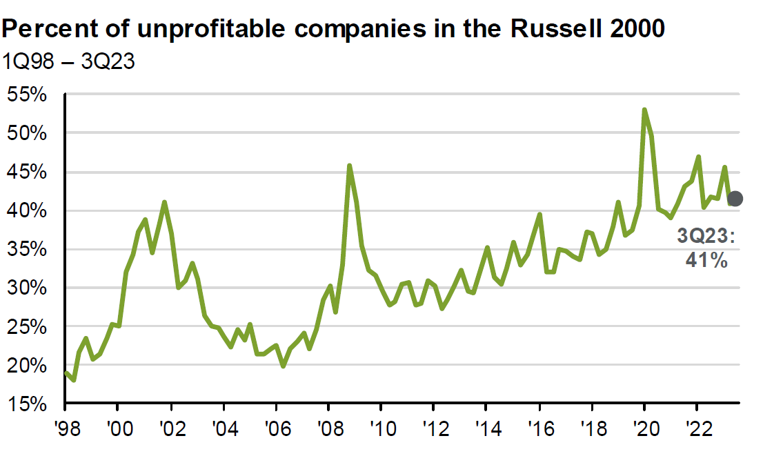
The Russell 2000 is an Index of smaller companies. Small companies create most of the jobs in this country, and therefore are very important to the US economy. They also are like a canary in the coal mine for liquidity problems in the financial markets. They often begin to struggle before the big company indexes like the Dow or S&P500.
This chart shows that the number of unprofitable small companies has risen steadily and is now close to the peak of the financial crisis of 2008. Right now, the Russell 2000 is still 15% below its 2021 highs, while other indexes are making new highs. This weakness in relative strength of the Russell 2000 is another risk factor that is rising and suggesting weakness to come in the S&P 500 Index and Dow Jones Industrial Average.
This next chart shows debt coming due over the next few years held by large banks (dark green) and small banks (shown in light green).
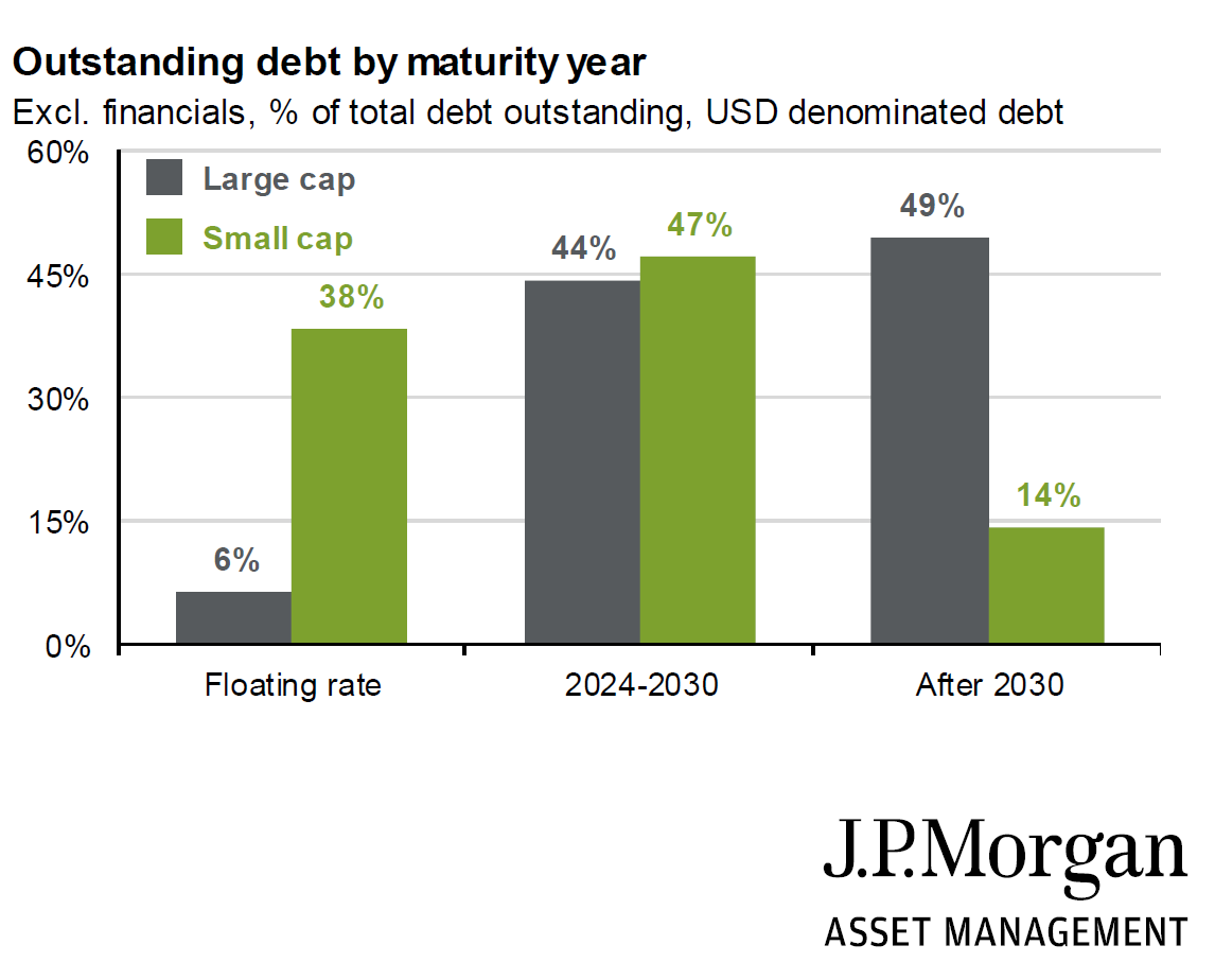
Most of this debt, if it gets refinanced at all, will be at higher rates. This translates to even less profitability – and possibly more defaults or bankruptcies in our future. This debt overhang is another condition providing significant risk for smaller companies going forward.
To avoid being caught up in a debt collapse, lower debt levels are something that I like to see in our investments. I want to buy companies for my clients that can survive an economic disruption. Lower debt equals survivability, in my opinion.
Our next chart addresses a structural problem impeding economic growth in the US: a declining number of workers.
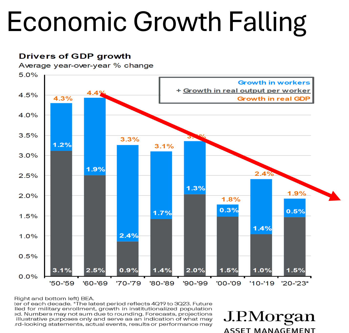
Economic growth can be calculated by multiplying the number of workers times their productivity.
Productivity, shown by the gray bars in this 70-year chart, has been fairly steady, hovering around the 1.5% level over the last 50 years or so. But the number of workers, shown by the blue bars on this chart, keeps getting smaller and smaller.
Declining overall growth is another condition that spells lower potential gains for financial markets unless this dynamic can be reversed. Lower potential gains means I want to take lower risk pursuing it.
This next image shows banks’ percentage of business from different activities. Banks are a major part of our economy, and they also will be coming under more and more strain over the next few years due to commercial real estate problems.
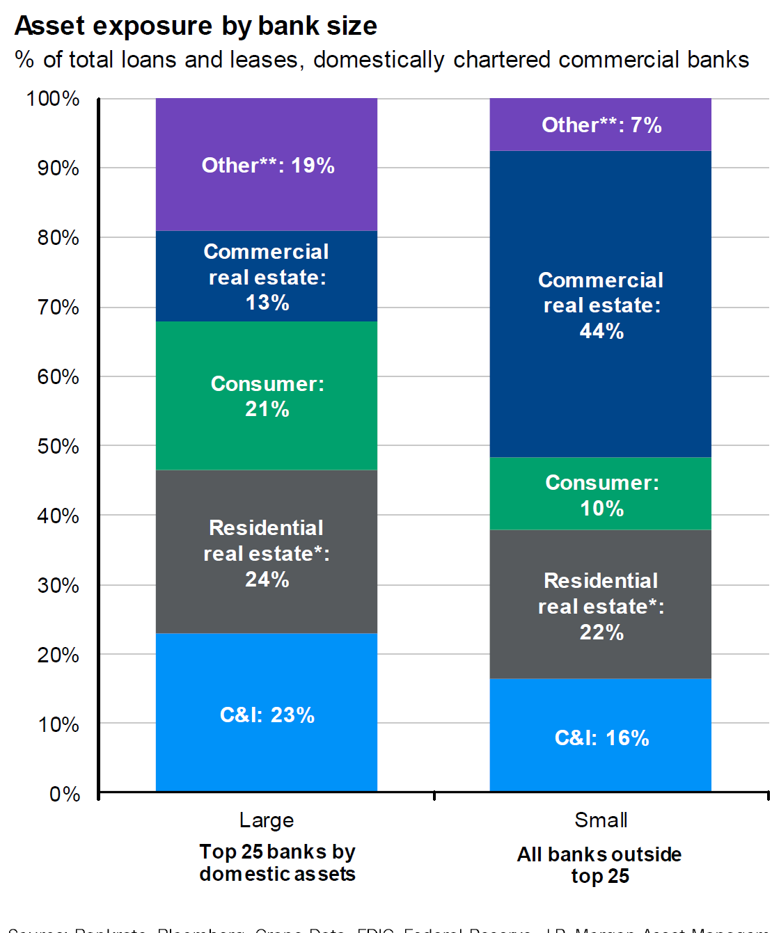
It is no secret that demand for retail space is lower due to the shift to online shopping. Many offices are sitting empty as technology allows workers to shift to working from home, especially in big cities. Owners of these properties are struggling to repay their loans.
This chart shows small and large banks’ exposure to commercial real estate loans in dark blue. Smaller regional banks have more than 3 times the exposure to commercial real estate as large banks.
If there is a wave of defaults in commercial real estate loans, small banks will be hit hard. They will be forced to cut back lending in other areas, impacting economic growth or perhaps go out of business.
Community Bank of New York is in the news recently, teetering on the brink of failure. My guess is that this is the tip of the iceberg.
Our last image shows the Wall Street Journal’s forecast of office real estate loan delinquencies over the next two years. The gray bar is 2023, the blue bars are this year and next.
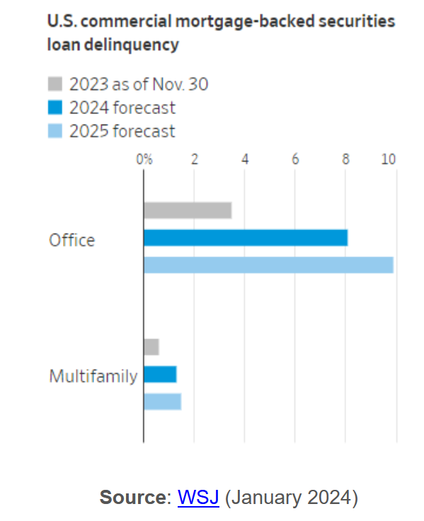
Delinquencies are expected to triple over the next few years which will hamper the ability of small banks to keep lending. This is another condition suggesting another spate of bank failures from this, as well.
The S&P Regional Bank Index ETF (KRE) confirms my feelings on the weakness of smaller banks by being down 36% from its highs two years ago during a time in which the broad indexes recovered their losses and are posting small gains.
These are just some of the things that we here at Shadowridge have our eyes on over the coming months. Stay tuned as we help you navigate the changes ahead!
